
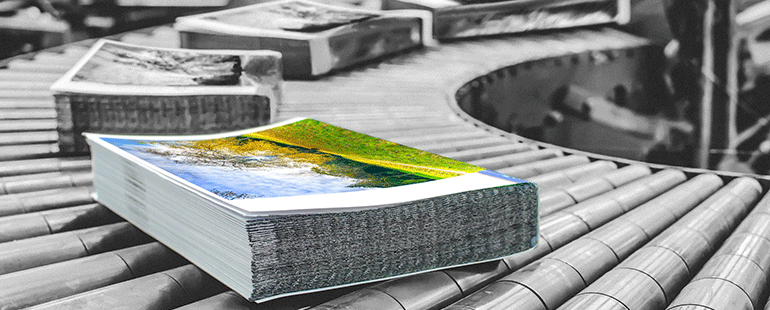
In the world of sales and marketing, paper is where ideas unfold and your brand story is told.
It’s a big deal. Add to the fact that paper averages 30 percent of the cost of a print project—a substantial investment— you want to get it “right.” Whether you’re printing offset, digital, or inkjet, paper will impact the final printed piece. We provide a few pointers to help you understand what goes into selecting the best paper for your printing needs.
What kind of print job is it?
The first question to answer might seem obvious, but determines the function of the piece. What, exactly, are you printing?
Grades of commercial printing papers:
Bond or writing: Letterheads, business forms, copiers
Book: Most common, used for coated and uncoated
Text: High-quality sheets in multiple surfaces and colors
Cover: Used when greater bulk is necessary
Tag, bristol, index: Smooth surface papers, mostly uncoated
While you’re thinking of the type of project you’re creating, you’ll also want to think about the type of material you’ll use. Most papers are made from wood, but an environmentally friendly option is to look for paper that has been produced from cloth and synthetic fibers. In addition, you might want to consider paper marked Totally Chlorine Free (TCF), or Processed Chlorine Free (PCF).
Paper finish
This will affect the feeling of your product. Items with a lot of photos, illustrations, or elements that you want to “pop” off the page look better with coated (glossy) paper (think brochures, catalogs, postcards, packaging).
Coated papers come in matte, semi-matte, silk, or gloss finishes. Uncoated paper is better for stationery, flyers, and newsletters. With fluorescent inks and knowledgeable pre-press technology, the natural surface of uncoated papers can be an ideal background for four-color process printing.
Paper weight
People identify paper in terms of weight. The greater the weight, the thicker the paper. The weight is determined when the manufacturer weighs a ream, or 500 sheets of paper. How do you know what weight is right for you?
• 20-24#: standard paper weight (good for black and white printing, not good for color)
• 60# text: copy or printer paper (legal documents)
• 80# text: heavier paper (presentations, flyers, posters, or brochures). This works well when you want thicker paper, but don’t want to print on card stock.
• 120# cover: basically thin cardboard (letterpress, postcards, business cards, and note cards).
Tip: Choosing an acid-free paper for posters will help prevent yellowing.
Paper brightness & paper whiteness
There’s a lot of confusion about this, but paper brightness and whiteness are not the same thing. The brightness of paper is the measure of a paper’s ability to reflect light (if your paper was a light bulb, this would be the paper’s “wattage.”) It’s measured using a blue light on a scale of 1-100 (100 is the brightest). The brighter the paper, the more readable it will be.
A bright, quality sheet is usually more expensive. Fillers and chemicals, such as fluorescent dyes and optical brighteners, are needed to create the paper’s brightness. While they help give the paper a blue-white shade, they also take a toll on stability and how well the paper will run on the press.
Whiteness is the way the eye sees paper. It’s a measure of the color of the reflected light itself (keeping with the light bulb analogy, if your paper was a light bulb, this would be the quality of the light). The whiteness rating—also using a scale of 0-100—refers to the shade of the paper: balanced white, warm white, and blue white.
A balanced white reflects the color spectrum equally and is often used for precise and exact color reproduction, warm white absorbs the blues and warmer colors (good to use with text-heavy designs), and blue white absorbs the warm colors and reflects cooler colors, making blue tones enhanced. Every paper mill has their own recipe for how they create these shades. It’s okay—even encouraged—to request samples.
Once the preliminary design is done, get quotes from different printers. Tell them you’re open to suggestions. A reliable printing partner, like Streamworks, will work with you to ensure the best outcome of your project.
Uncover opportunities to improve your existing marketing campaigns by saving money. Sign up for our FREE Education Email Series Direct Mail: Cost Reduction Strategies for more cost-saving strategies.

![]()
(800) 328-5680
3640 Pheasant Ridge Drive NE • Blaine, Minnesota 55449
Copyright ©2014 Streamworks, LLC. All rights reserved. Privacy Policy


