
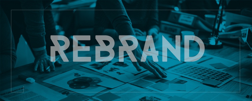
To stay competitive in an evolving marketplace, many brands find it essential to undertake a rebranding process at some point in their lifetime. Though most emblematically represented by the company’s logo – which is usually either updated or flatout replaced – a rebrand involves a comprehensive updating of company messaging, product offerings, style, and ethos.
A successful rebrand can extend your audience, reinvigorate the interest of longtime customers, and give the company new life. But rebranding is not without its risks. You can probably think of several infamous rebrands right off the top of your head: Gap’s short-lived logo, which was so lambasted it lasted all of six days. Tropicana’s repackaging attempt, which cost the company a 20% sales dip. Instagram’s new icon, which has received mixed reviews, to say the least.
Of course, the logo is what receives the most public attention and discussion. So, aside from subjective opinion, what determines whether a logo is successful or unsuccessful? How well it represents the broader changes in the brand’s values and/or direction.
Imagewërks Marketing (our in-house creative and digital agency) recently detailed their favorite and not-so favorite rebrands of 2016. Check out their blog post to see who did (and didn't) make the list.
![]()
(800) 328-5680
3640 Pheasant Ridge Drive NE • Blaine, Minnesota 55449
Copyright ©2014 Streamworks, LLC. All rights reserved. Privacy Policy


